I really don’t like the design of the progress pride flag, and I couldn’t really put my finger on it until I saw this: https://nava.org/good-flag-bad-flag
For reference, here is the flag I’m referencing as “bad flag”:

And here is the original:

So, the original has too many colors, but it’s the colors of the rainbow. In order. It’s recognizable from really far away, and it’s dead simple to draw.
With the Intersex flag, that’s 14 colors. There are three shades of “purple”. The circle won’t be visible from far away. The chevrons are too thin to be very recognizable from far away.
It’s not like there aren’t good pride flags. Like there are AMAZING ones:




Edit:
In case you don’t know what these are: https://flagsforgood.com/collections/pride-flags
it’s a long time meme that pretty much all LGBT flags are awfully designed. but they also got wide acceptance so it’s hard to redesign. as a designer I’ve looked for redesigns and have not seen anything really. even the ones you’ve shared are brand new to me. where did you find those?
The progress flag is copyrighted by one Daniel Quasar, and he sporadically exercises his copyright on people who use the sell designs involving the progress flag. Or so I’ve heard. Anyway, for this reason, I avoid using it.
i was sceptical of this claim but it appears you’re dead right
Most people do not know about this flag’s origins. Its creator appropriated Gilbert Baker’s 1978 rainbow flag and the light blue, pink, and white stripes from the 1999 trans pride flag created by Monica Helms (without even a call to her), and the black and brown stripes from the 2017 More Colors More Pride Flag designed in partnership with Philadelphia’s Office of LGBT Affairs and then proceeded to LICENSE THE DESIGN FOR PROFIT
https://gaycitynews.com/we-need-walk-away-progress-profit-flag/
rest of the article is interesting too
this just makes it all the more baffling that this graphic-design-is-my-passion gaudy clashing mess of a flag is the one you see everywhere now
That’s wild. I would have retained the copyright too, but for the purpose of suing the fuck out of people who misuse it
Even if that were what he’s doing, I would still avoid using it as I’m a supporter of the public domain on principle. If something is essentially public domain, it should be fully public domain.
What annoys me about takes like this is that it seems to be appealing to some sort of council of gays who are in charge of the flags. Nobody is. There’s no “official” flag. If you don’t like the progress flag or the intersex version of it then just don’t fly them or design your own that you do like. Nobody is stopping you. A ton of the pride flags in use today are just designed by random Tumblr users in the mid '10s. Which is fine, not hating on them, just making sure you know there is nothing stopping you from making one you like or flying the ones you prefer.
This is the very reason I’m surprised. These flags come and go by the winds of memetics; so why is it that this design is somehow able to propagate so well despite being so clearly visually incoherent?
I’m not necessarily complaining, I’m just astonished that it caught on. Like imagine if a really discordant and structureless song became super popular.
I fly the original pride progress flag on my house and I really like it. If it is shocking to you that not everyone agrees with what makes a flag look good look no further than the US’s state flags. They’re a mess. They’re all over the place. People have different tastes. I think the “state seal on blue background” is bad but clearly enough people in those places don’t dislike it enough to change it.

That’s not actually the original pride flag. That’s the one with 2 mission stripes that were taken away due to cost. The original had turquoise instead of blue and a pink and indigo stripe, so one color more than the rainbow. Rainbows have red, orange, yellow, green, blue, indigo, and violet.
The 8 striped also symbolized different things. https://en.m.wikipedia.org/wiki/Rainbow_flag_(LGBTQ)
I agree with what you’re saying. As they keep adding more things to the flag, it becomes cluttered and harder to see.
I’m of the option that the original rainbow flag is still the best. It was meant to include everyone under the rainbow so trans people and others are already included.
Was it meant to represent black and indigenous people?
Does it need to?
Not sure why you would ask that. I’m responding to this claim:
It was meant to include everyone under the rainbow so trans people and others are already included.
Ah I get your point. Native and black people are their own sexual identity. Got it.
Aside from the design of the flags, scrolling through these ones felt a bit like a colour blind test. Especially the demi-flags.
meh I honestly kind of like it - I especially think the intersex symbol ties it together really well
i just learned last week about the original lesbian flag:

and i gotta say it’s amazing
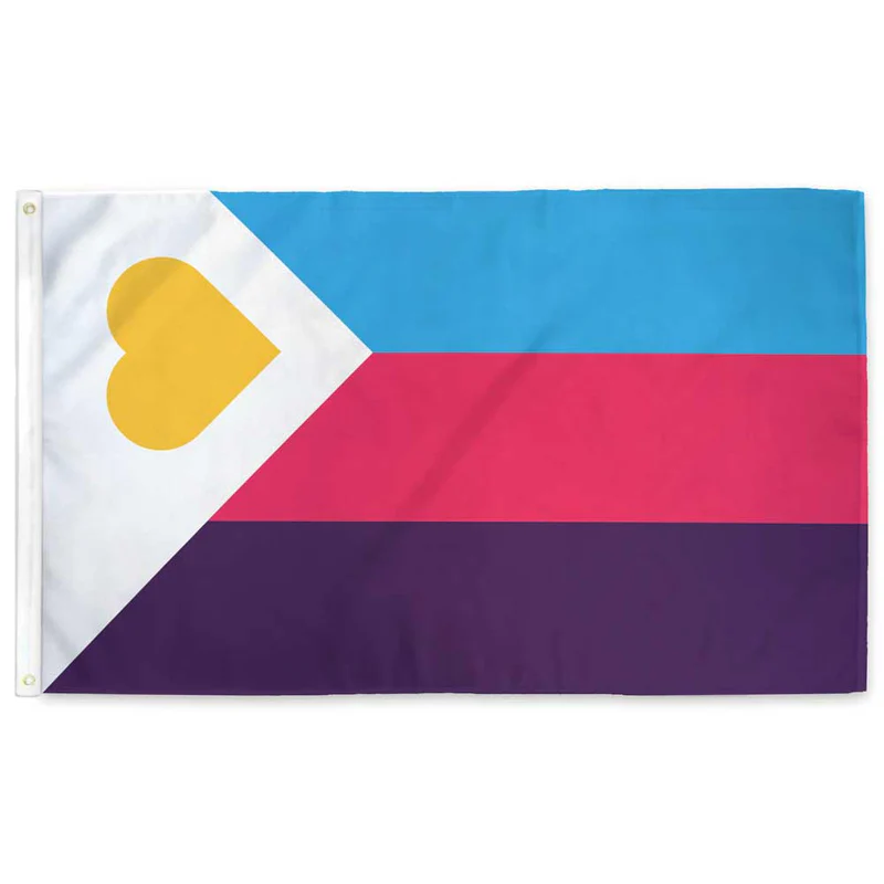
Why does everyone complain about the progress flag when the poly flag is right there and is terrible? Absolute garbage. Terrible color choices. Barely holds up to heraldic color rules. and Pi? Seriously? Get out of here you fucking nerd. 2/10, workshop it and come back. I hate it.
I’m cool with poly people, this is just the flag equivalent of biting your tongue when eating a burrito.
not to be exclusive but i dislike the contemporary trend of trying to shoehorn polygamy and polyamory into LGBTQ spaces, tbh.
i personally dislike poly, admittedly, but i don’t really think it should be illegal or anything either ig. either way, it’s a lifestyle choice one makes and not an immutable facet of your identity that you’re born with, which i know is an increasingly controversial opinion these days but tbh i don’t think poly people experience oppression or bigotry the same way queer people do and it’s disingenuous to act like they do. it honestly makes me kind of upset to see people so widely positing such a position. i know the inevitable comparison of this rhetoric im using to the rhetoric used against queer people historically but i honestly don’t think that’s a very fair comparison in the case of poly, but that’s a whole can of worms itself.
again, not really an attack on poly people or their right to exist. i know my personal disdain of it probably shines through a bit here in my voice but i don’t want to come off as rude.
Aah bad flag jumpscare
That’s the old secret code one. The new one is listed in this post already

I think it’s basically just “feature creep.” Too many ideas trying to be crammed into one symbol. And what’s annoying, to me, is that the rainbow by itself was already supposed to represent everyone. That’s why it is a rainbow.
I guess I would like to schedule a meting with the project manager and/or customer to discuss the flag specification…
Make sure someone takes minutes so we can maximize our synergies and deliverables.
It’s the same phenomenon as “LGBTQI+”
It was literally LGB at one point. I understand the concept of inclusion but I think pursuing it by appending and appending and appending is a lousy way to go. I believe the “Q” was finally added in part because it was hoped to be some kind of catch-all, but that didn’t work.
We could always use the GRSM acronym (Gender, Romantic, and Sexual Minorities)
I just learned about GSM two days ago here on Lemmy. Now I am learning about GRSM, and while I like both, learning that there is now an additional letter leads me to believe it may go down the same rabbit hole.
Really? I’ve never heard just GSM.
I’ve gone down the rabbit hole and gsm is apparently a common incorrect way to say it. Also a lot of LGBTQ people dislike the term.
Really? Why?
I’m just hearing it for the first time in this thread but my first impression isn’t great. Do you really want a label that brands you as a “minority?” That doesn’t seem like a great first step toward equality.
Oh shit I unironically like this.
I’m a fan of it but it doesn’t seem widely known. Maybe we should spread the word.
Maybe we should shorten it to Q++ 😅 (j/k)
I propose reducing it down to QT
You have reached enlightenment. The universe has no more secrets to you, young one.
You know too much.
CATCH THEM, BOYS !

Ugly flags & the LGBT+ community, name a more iconic duo. Like, I thought we had designers amongst us, whatever happened to them?
But you see, Graphic Design is their passion!
Who owns the intellectual property of these flags?
Americans love to subdivide themselves, and that’s especially true for activists. The flag reflects that.
Thats way too busy. Should definitely just keep the rainbow flag. Not every little niche needs specific representation, just have the rainbow as a catchall for any kind of deviation from heterosex
Edit to add : if they want to use them to identify and specify within rallies or amongst themselves somehow then whatever, go for it, as long as we can accept the layman isnt gonna have a clue and cant really be expected to.
Here’s the thing though, I know this is an ally flag, but it’s like they never considered symbols:

Ignore the really bad black and white background for a second.
Imagine the left side of the shape is an homage to the original pride flag and the right side is WHATEVER YOU WANT TO PUT IN IT. Uniform clean design with representation. Easy to draw for the layman (fill both sides in with rainbow if you want), and easy to add specific representation
deviation from heterosex
Totally normal words to say. BTW trans and intersex people can still be straight.
Better get it on the flag then ig
what
I thought the rainbow was supposed to mean it encompassed everyone.
The colours on the flag apparently weren’t sufficiently inclusive so perhaps this should be the next flag:

But that doesn’t include infrared or ultraviolet 🤣
this fails to capture the grades of saturation.
Here is every color in the RGB (#000000-#FFFFFF) color space arranged sequentially on a Hilbert curve (but scaled down to 512x512)

Why are there jpg compression artifacts in your png?
Probably because it’s been downscaled from its full resolution.
Also rotated for some reason from the original? Or perhaps just rendered from the same mathematical sequence with some parameters swapped. Here’s an uncompressed one:
coool
there are a lot of pieces that use one pixel per color too! you might really dig what people can do with it: it’s honestly astonishing the kinds of arrangements they can make just by mixing the colors.
cool!
This gets my vote
I literally lol’d!
I call Lime Green as my personal inclusion color!!!
I would absolutely and unironically fly this flag, although to be even more inclusive it also needs an alpha layer. Perhaps it should be a cube? Actually even that might not be inclusive enough, we need more dimensions. BRB I need to figure out how to attach a tesseract to my flagpole, I guess I’ll need some kind of gordian knot?
But if you include alphas , you need to be inclusive of betas and sigmas, and other Greek letters still undefined
You need a hyperpole
I was thinking more adding from outside the visible spectrum. So a flag with the entire electromagnetic spectrum from ~10^-20 m to ~10^17 m
They all sprung up in that period where flags were trendy. Every little camp had to have one to feel like a singled-out tribe—and, no, this isn’t just kink flags. This meant many would be flag designers overnight.
The result is there’s some really fugly designs out there in the wild now and the idiots can’t go back. But most people are over flag phase now, so you’re unlikely to ever see this and most others out in the wild.
Nothing fails more at its job than a pride flag that people have no idea what is. It’s almost irony.
And is this one ugly? Oh, yes. Enough to turn a person straight.
The solution is inheritance. If you want a more specific flag, inherit from the rainbow, but add an insignia. Now you have a unifying flag that is more meaningful. Also you can skip the complexity of trying to make everyone stand out because the rainbow is all inclusive.
For example, I also like the pink triangle pirate flag. If you want a gay flag, take the rainbow and add that pirate insignia. Think like the US flag which is also a bunch of stripes but with some star insignia. Now you have one clear insignia on a field of inclusiveness
You’re right. Could literally design anything and people that know nothing about any of it could figure it out quickly. But instead, a salad of sex preferences, gender, race, kink, specific US cities, all appearing to be under the Intersex insignia.
It’s always seemed so bad to me that it’s more likely to be done by an anti-woke troll or someone like Michael Scott discovering Pride Month.
It’s just offensive. Obviously to the eyes, but also to any group being shoved together within its borders.
Imo, the rainbow flag is perfectly inclusive. By focusing on one minority, you make it less diverse and less inclusive.
Rainbow flag is best

