Obligatory “OrDeR cRaCkEr BaRgLe!!1!” meme reference.
is that the golden corral with a gift shop attached?

ok, so since we’re talking about the cracker barrel logo, can i ask the question i’ve always had about it?
what is the symbol/shape under the text? it’s like a bean with a pointy bit. is that just a style flourish? is it a silhouette of something foreign to my eye?
i’ve wondered this in isolation for years, but there was never enough interest in the cracker barrel logo for me to inquire about this until now.
Maybe the side view of a saddle? It feels familiar but not sure.
Kidney bean
I always assumed it was a lasso.
my money is on style-flourish as you’ve mentioned, but that pointy bit does seem out of place.
Just flourish, yeah. The rounding edge comes off the k wraps around, and at the end reverse curves upward as is popular in cursive and western calligraphy.
It’s a turd.
Right wingers are idiots, in the sense of being exclusively emotional driven. Like children, without the excuse of being children
Finally a bipartisan agreement that the new logo sucks
The nation is finally healing.
The day has finally come when we can embrace felon rapist pedophile supporters as our brothers and sisters.
I think that the idea of simplifying a logo is fine, but this drops a lot of the feel.
and the feel of cracker barrel is critical to the whole experience
Broken clocks are right twice a day.
Sometimes a calculator is a clock.
Is it really agreement? Do you feel that the new logo sucks because it’s flat, uninspired, and anodyne? Or do you feel that the new logo sucks because it’s an attack by the evil, communist, socialist, libdem, woke, LGBTQ community to remove all white culture from American society?

At least put the brown border around it back. It looks so plain.
please talk about brands bro
its so important to constantly talk about and reinforce the existence of american brands bro
do you think they are woke or cringe?? hey what about their commercials??? talk about the brands
we all have to talk about american brands bro this is what real life is
They just keep getting weirder and weirder.
Anything to take their focus away from the Epstein files.
Here’s a logo comparison of old to be, because the article didn’t for it for some reason:
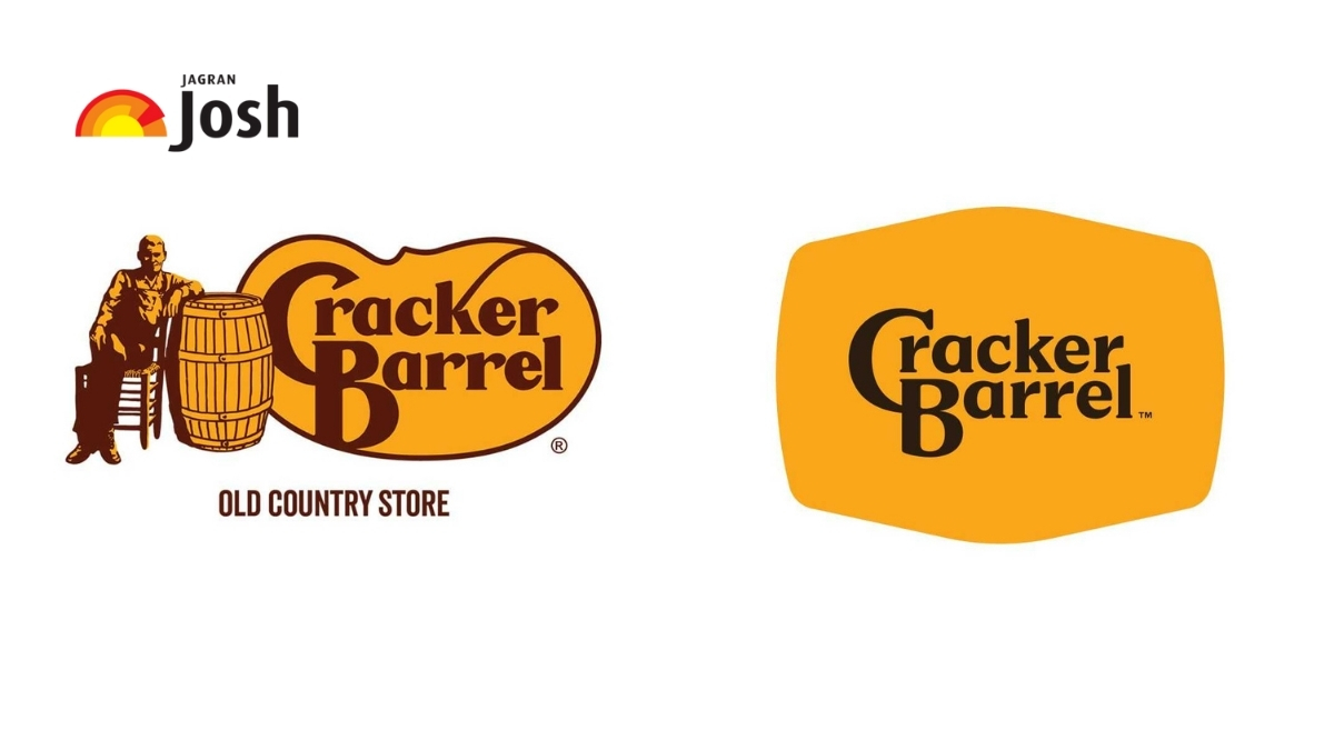
The personality got sucked out, and all that was left is a indistinct husk.
To be fair it’s tasted that way for far longer than they’ve been remodeling
So it fits their food. That’s great advertising.
Looks like a belt buckle for a cowboy
Definitely worse, no doubt about it.
It’s a lot simpler
It looks MORE like it’s from the 70’s.
Maybe that’s the goal. Is Dennys still around. This reminds me of their logos general shape, but melted.
I like it the direction, but the topography needs adjustments. Full disclosure I’m also a design snob with a fucking BFA who got stuck coding shit for the last 20 years.
I mean like the UV brittled plastic retro microwaved steak & potatoes with a sprinkle of asbestos variety of looking like the 70’s. Not the nostalgia kind. It’s a vibe and i guess it fits the restaurant.
More generic
Yep. Generic is exactly how I’d describe it too.
Republicans really love cancel culture I guess 🤣 🤣 🤣
If they and Jaguar had changed their logos 15-20 (whenever the switch to minmalistic styles was) years ago, this shit wouldn’t even be news.
That’s what I was thinking. And people have been criticizing flat designs for years now and MAGA is only now just noticing?
Sure it would have.
We complained about all kinds of trivial shit 15-20 years ago.
I think Jaguar getting rid of the Jaguar in their logo would have been mocked at any point in time.
In case anyone was wondering if conservatism was a mental disorder.
Nah. They chose this. End them.
Something something Buttfuckers
Fudruckers? Nah different place.


